
Self-initiated concept · Face care and color
Kate
Charlotte
A premium face care and color brand concept, developed from positioning to customer experience.
Explore the case studyThe idea
Care begins with attention.
To what touches her skin, what it does, and why it earns a place in her morning.
The signature botanical
Meet the resurrection plant.
Myrothamnus flabellifolius. Dry in drought, open again after rain.
The hero product
Replenishment. Within reach.
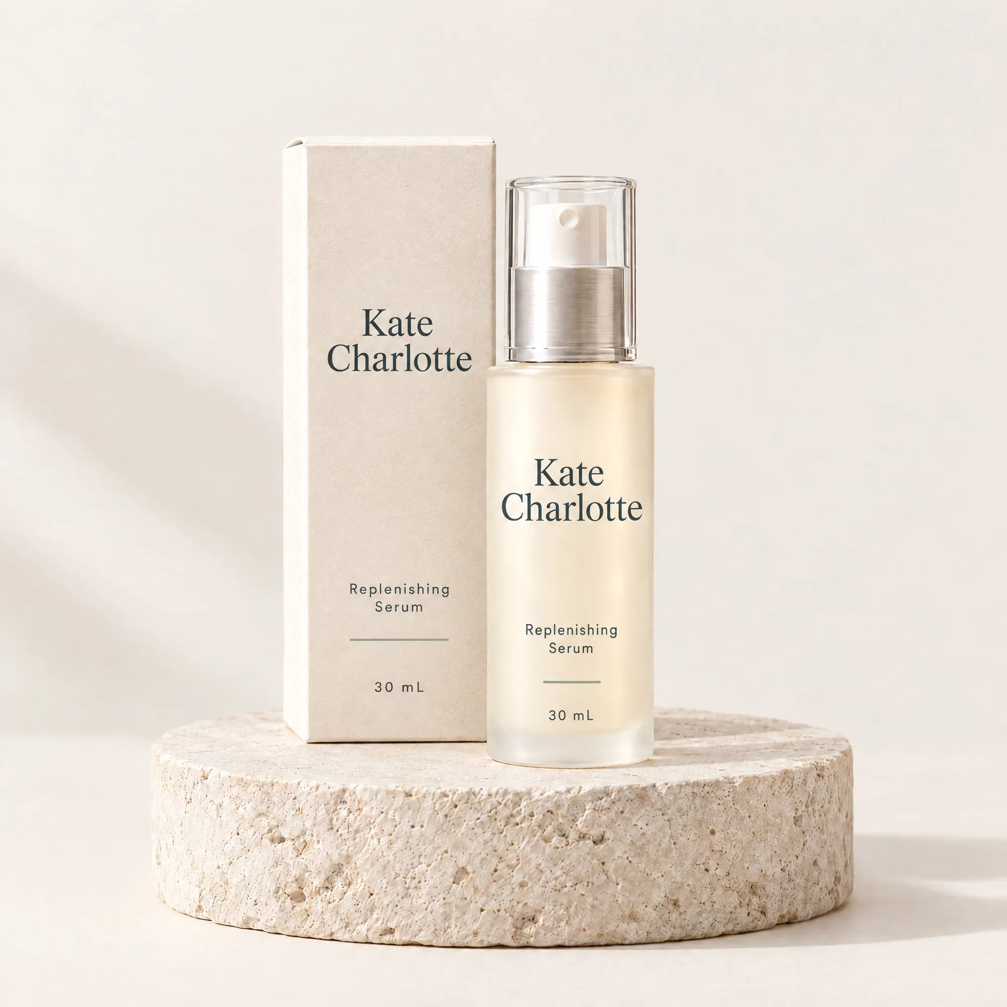
The Replenishing Serum leads the range, in ivory-coated frosted glass.
The range
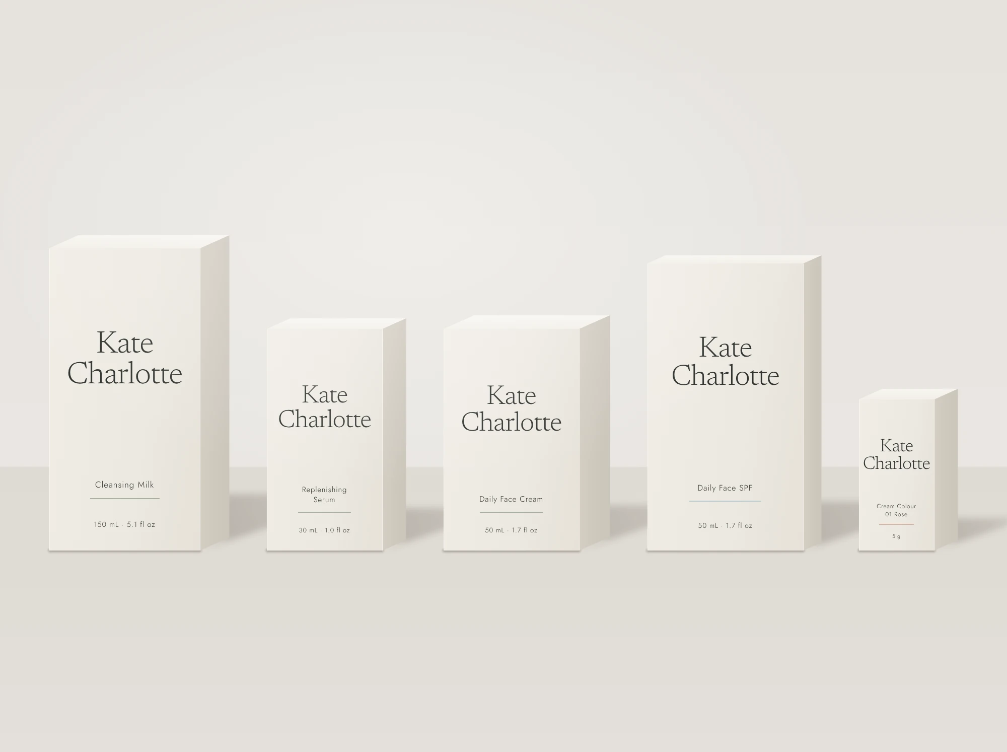
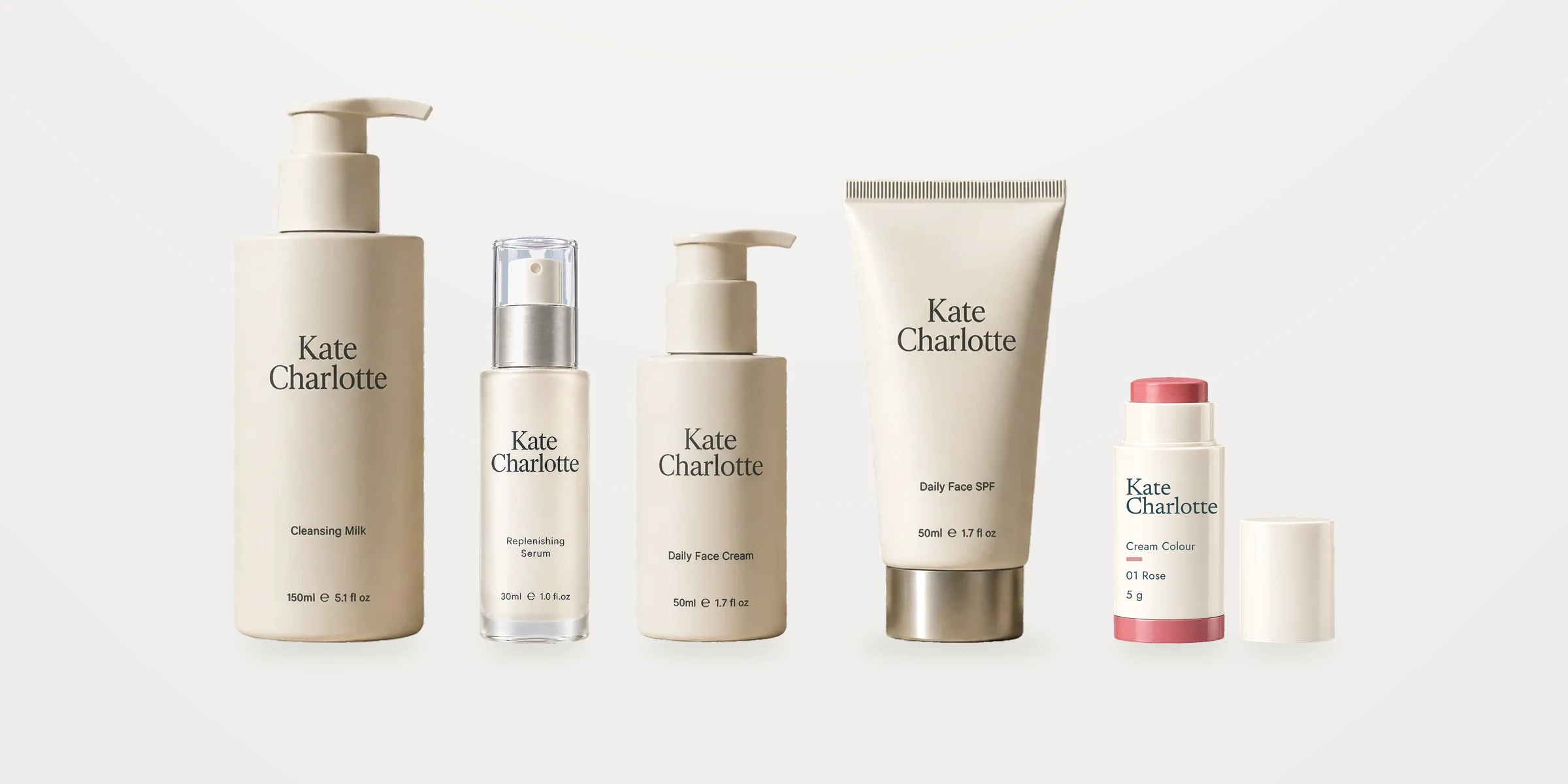
Five products. One clear routine.
Cleanse, replenish, moisturize, protect, then a touch of color.
Case study · Conceptual brand
A beauty brand concept, developed from positioning to customer experience.
My role
I created the concept and led it end to end: positioning, range architecture, identity and packaging direction, campaign art direction, and the channel strategy across web, CRM and social. AI tools supported production; the brief, the decisions and the final edits are mine.
The brief: premium care with clearer reasons to choose.
She reads labels, notices texture and will pay for quality, but she expects to understand what she is buying. Premium skincare tends to answer her with adjectives and extra steps.
The answer is a small range where every product has an obvious job, an ingredient story that stays honest, and an experience she would recognize from the pack to the inbox.
“Fewer decisions in her morning, without giving up pleasure or choice.”
The working hypothesis behind the range. It is written into the guide as something to test with customers before launch, not a finding.
Positioning
For women who choose their care thoughtfully, Kate Charlotte offers premium facial care and versatile color, rooted in a South African botanical ambition and designed around comfort, sensory pleasure and everyday ease.
Every pillar has to change a decision.
Considered care
Select every ingredient for a stated role and test the finished formula.
Effortless use
Give each product one clear job. Develop color for more than one intended area.
Sensory pleasure
Specify glide, absorption, finish, scent and how the pack feels in the hand.
Respect for nature
Investigate traceable sourcing, material reduction and practical replenishment.

 RevivedDormant
Meet the resurrection plant.
Myrothamnus flabellifolius
A southern African shrub that can dry out almost completely during drought and open again after rain. It gives Kate Charlotte an ingredient story people remember, and a visual world of stone, water and light.
- Family
- Myrothamnaceae
- Native range
- Southern Africa
- Brand role
- Signature extract, development brief
The rule that came with itThe revival is a story, never a skin claim. Origin, plant part, extraction and concentration are confirmed in the formula before any sourcing line is published.
Five product types. Each with one job.
Face care leads, SPF belongs in the daily collection, and color extends the routine. Every product carries one callout and one supporting line, so the range reads the same on pack, page and post.
Replenishing Serum
02 / 05
“Replenishment. Within reach.”
- Size
- 30 mL, metered pump
- Role
- Ingredient-led skincare hero
- Support line
- A daily layer of hydration.
- Price
- $78 hypothesis
Sage accent for leave-on care
Formulas, sizes and claims are proposals. Prices are concept hypotheses in USD, to be validated against costs, margin and willingness to pay.
Four shades. So many ways.
One formula architecture in four shades gives the color range assortment depth from day one. The swatches are illustrative shade studies on light, medium and deep skin; final shades would be set after formulation and wear testing.
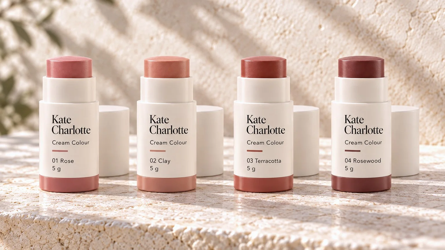
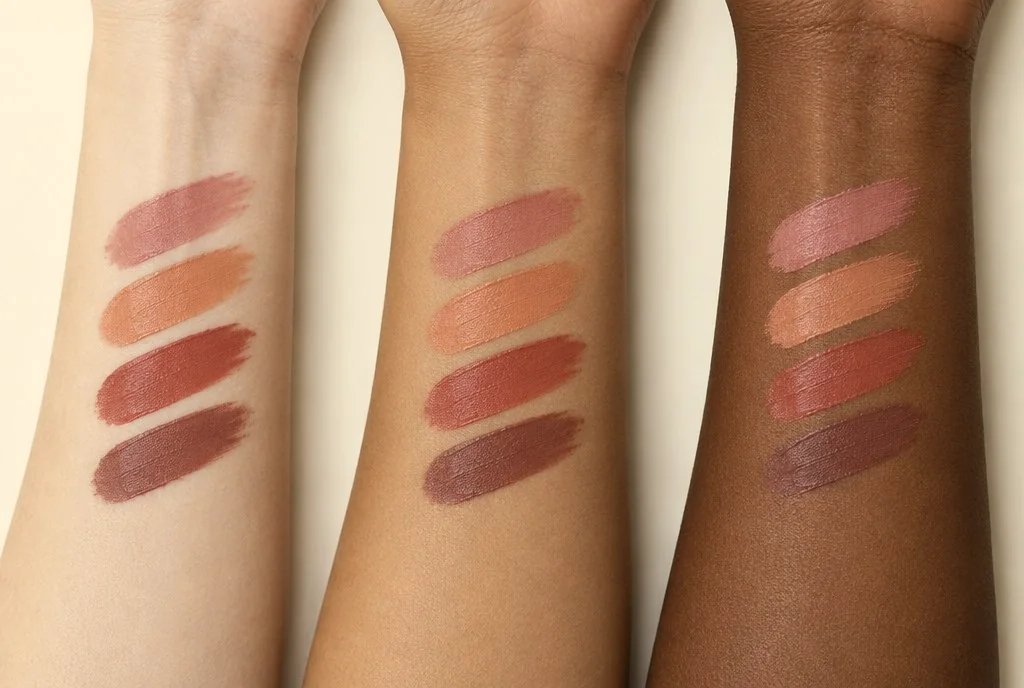
- 01 Rose
- 02 Clay
- 03 Terracotta
- 04 Rosewood
Light, mineral and botanical.
A composed serif wordmark with both names given equal weight, a stacked version for narrow packs, and a KC monogram for caps and avatars. The palette is drawn from Cape coastal light and limestone, with three accents that code each category.
Kate Charlotte
Primary wordmark
Kate
Charlotte
Stacked
KC
Monogram
- Ivory#FDFCFAMain ground and packaging
- Limestone#D6D1C6Secondary ground
- Mist#C6CBC7Quiet supporting ground
- Mineral Blue#BCCBCDSPF accent
- Botanical Sage#AAB2A3Leave-on care accent
- Soft Rose#D7B5A6Color accent
- Coastal Slate#7C929FDigital actions
- Ink#282B29Text only, never a ground
Aa
Newsreader Light
Display and editorial headlines. Sentence case, short lines, generous space.
Aa
Jost Light and Regular
Product names, directions and labels. The sans carries everything a customer needs to read at actual size.
One family, read at a glance.
Brand name first, function second, net contents at the base. Skincare labels sit on a centered axis; the Cream Colour stick sets its label left to carry the shade. On every carton the wordmark sits at the upper middle, never at the top edge.
Coastal Slate is reserved for gift sets, kept apart from the ivory everyday range, and remains an exploration. Materials, refillability and recyclability stay proposals until supplier testing.
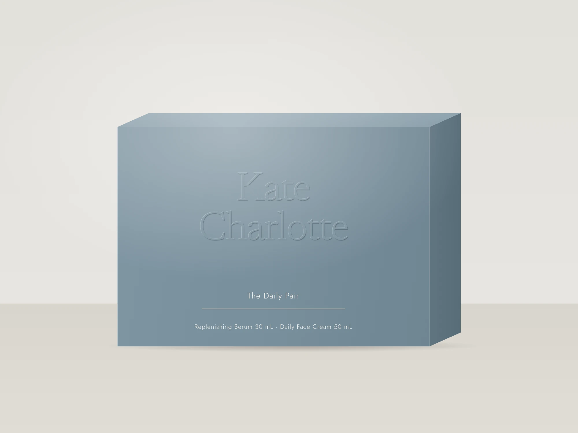
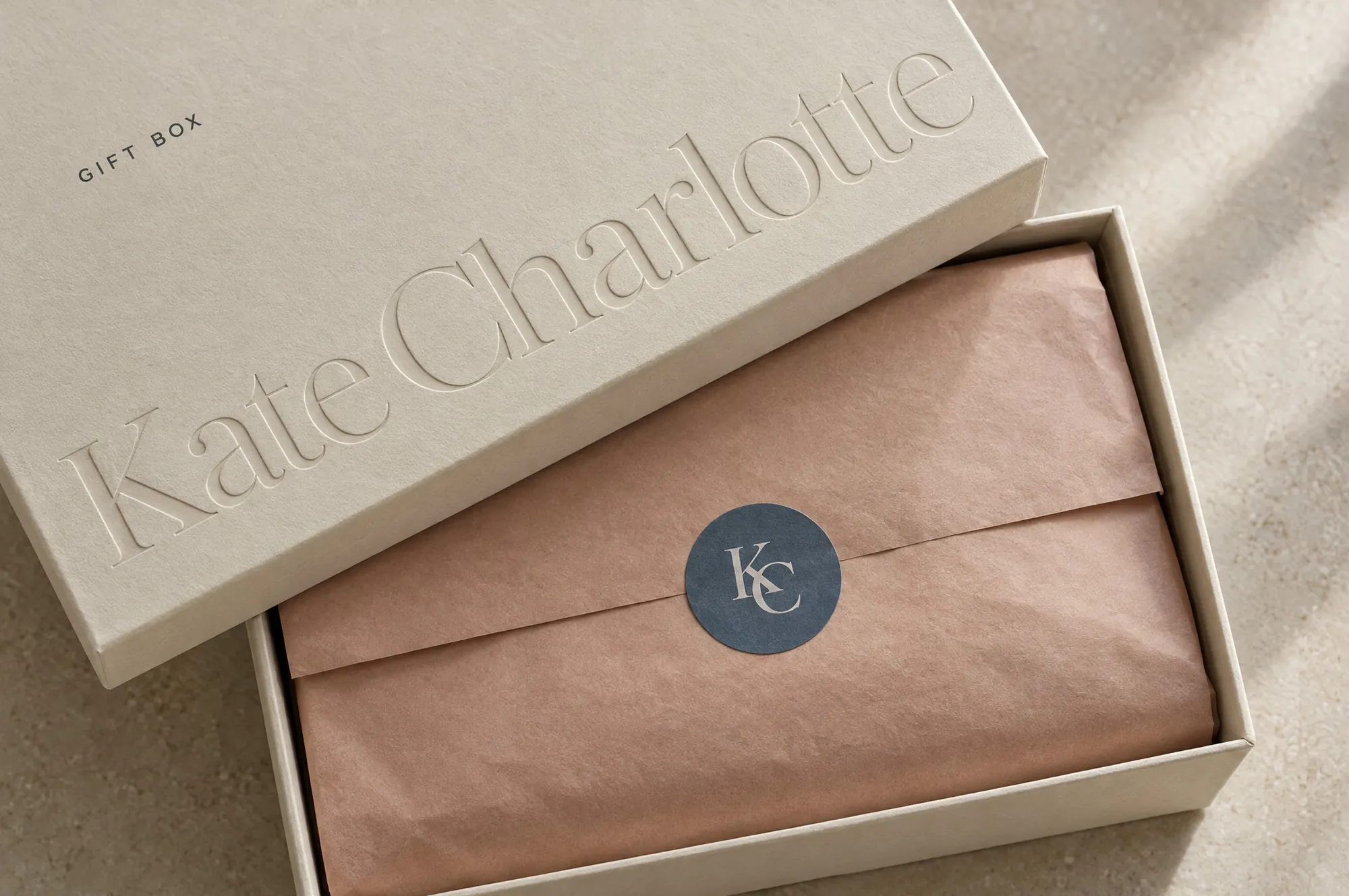
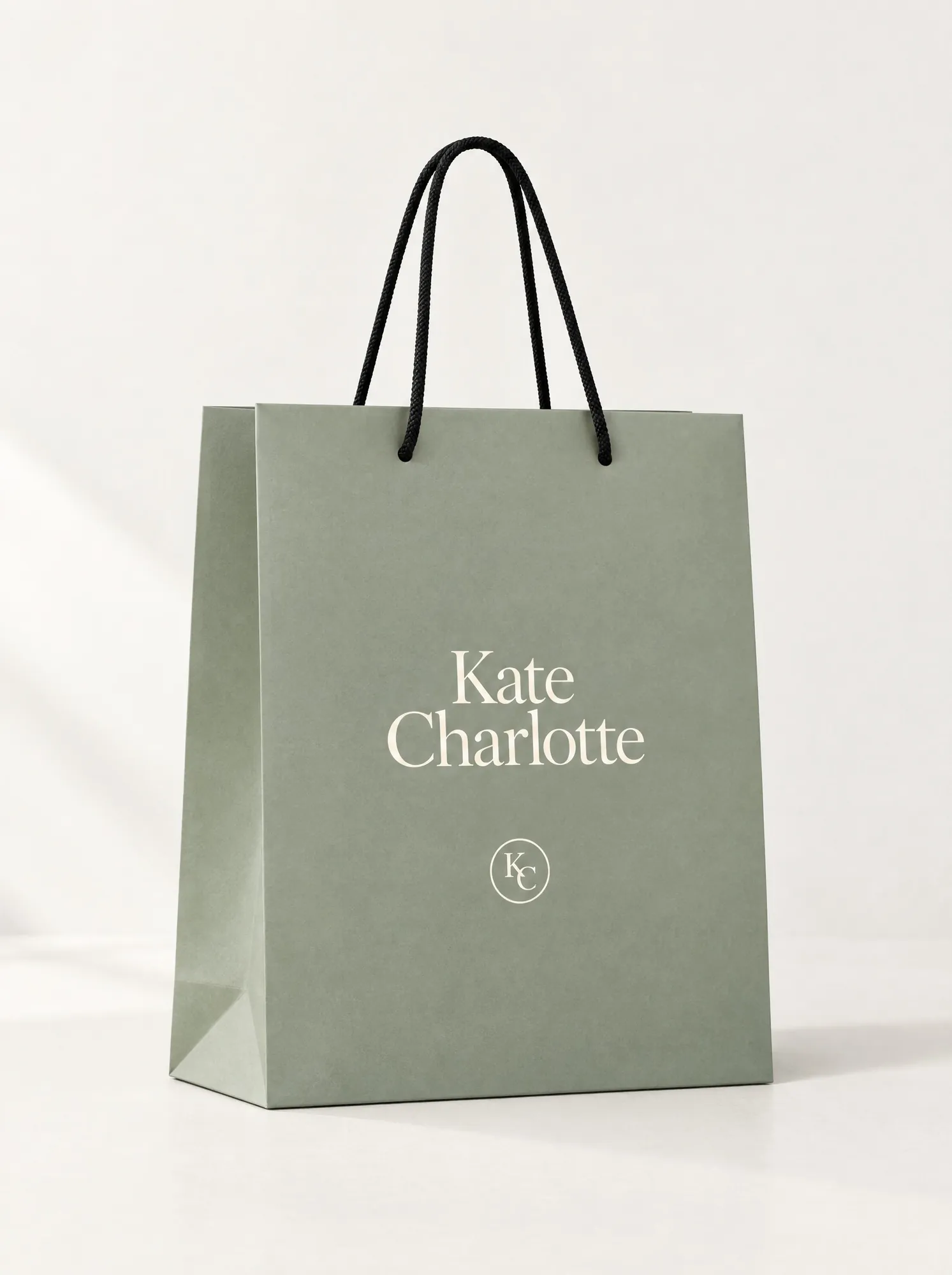
Care woven into ordinary moments.
Three repeatable compositions: a campaign image with room to breathe, a precise product study on a neutral ground, and paired images that each prove one decision. Cape coastal light and real skin texture throughout.
Campaign
The emotional world. One coastal still carries the hero: cleanser and color on limestone, sea light, nothing staged.

Product study
The precision counterpart. One master per product, the same label artwork, light and contact shadow, so the family reads as designed together.
Ritual
Where the products live: the morning window and the moment of use.

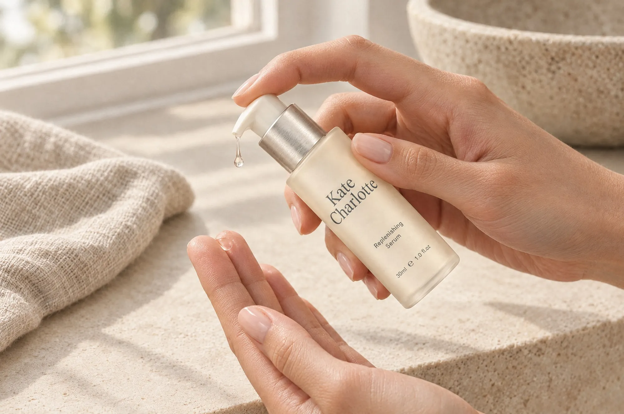
Texture
Real skin and real texture, shown rather than described.


Image sources: Higgsfield (above the sea, morning window, within reach, at the mirror, and the product masters composited for the family shot). Adobe Firefly (everyday comfort).
From first click to second purchase.
A homepage that leads with the routine, then color, then the ingredient story. A welcome series that sets the tone, then teaches the routine one product at a time. Every action uses Coastal Slate; Ink stays on text.
Planned measures
ConversionShade selectionSamplingOrder valueReturnsRepeat purchase
No commercial results exist for this concept. What each measure would teach is set out in section 10.
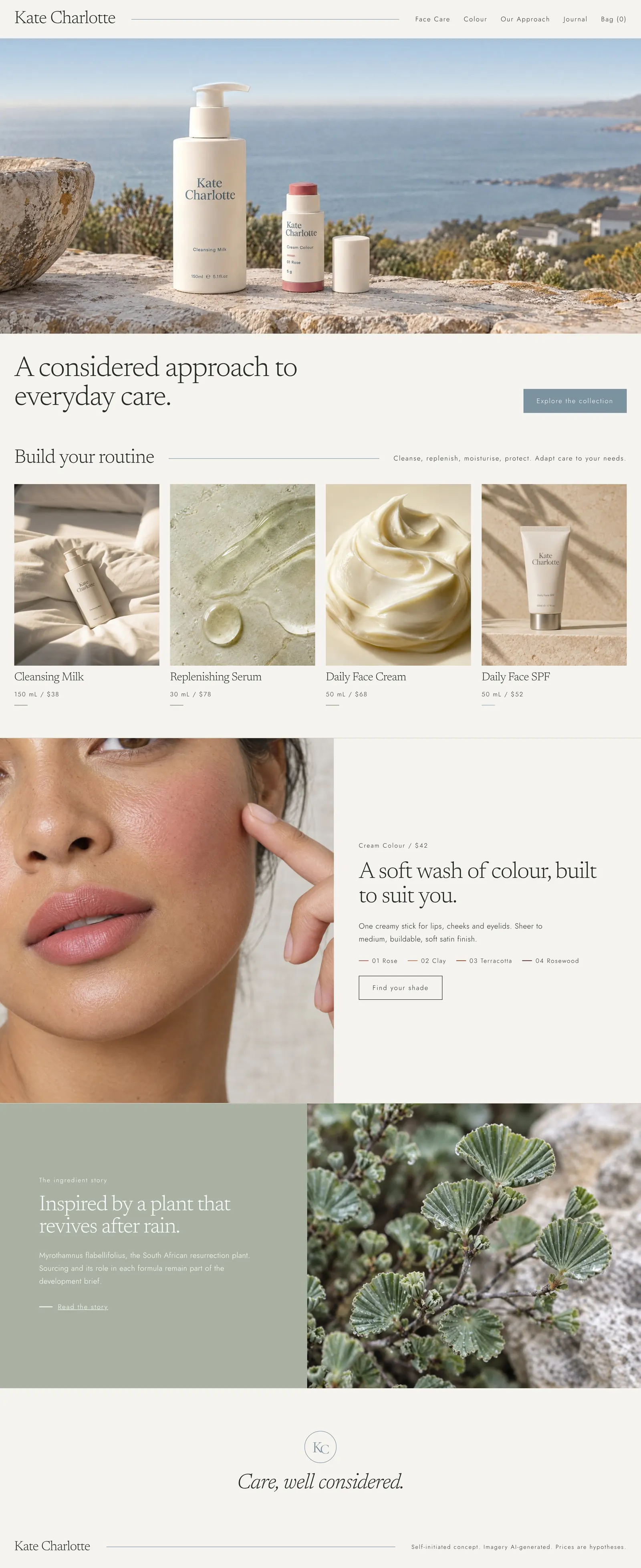
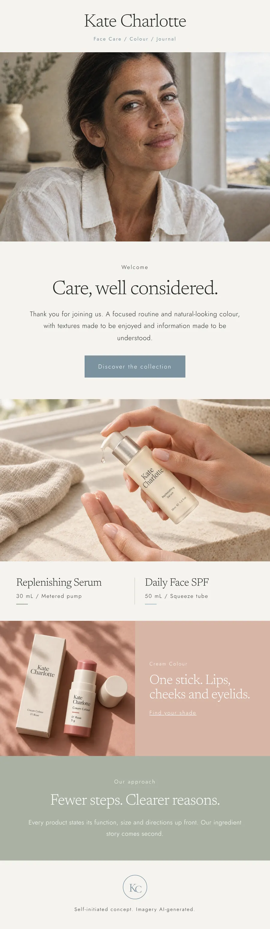
One useful message per post.
Each post leads with one product and one idea. Packaging carries the branding; additional wordmarks are used selectively. Type sits in the image's own quiet space, in white or Ink.

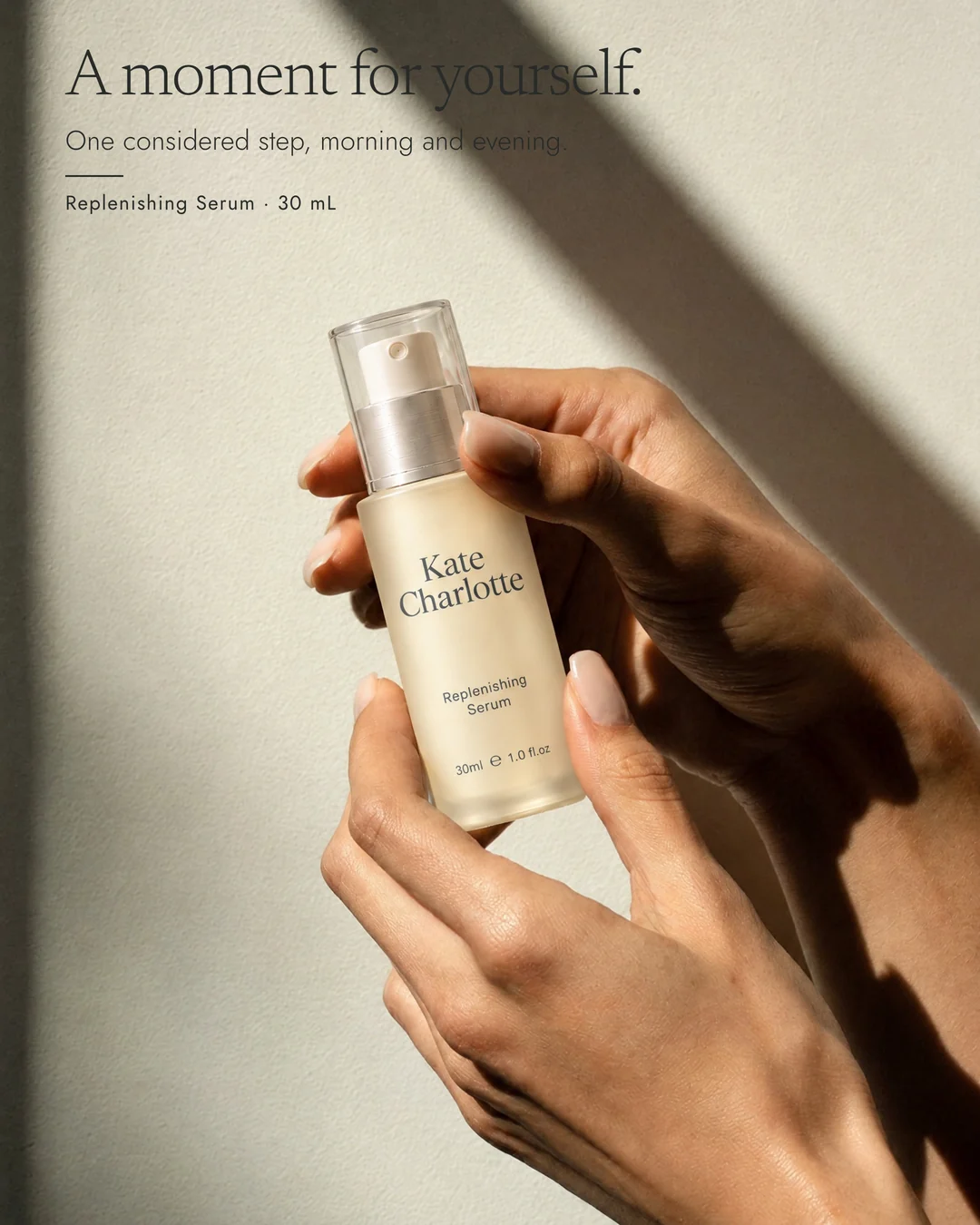
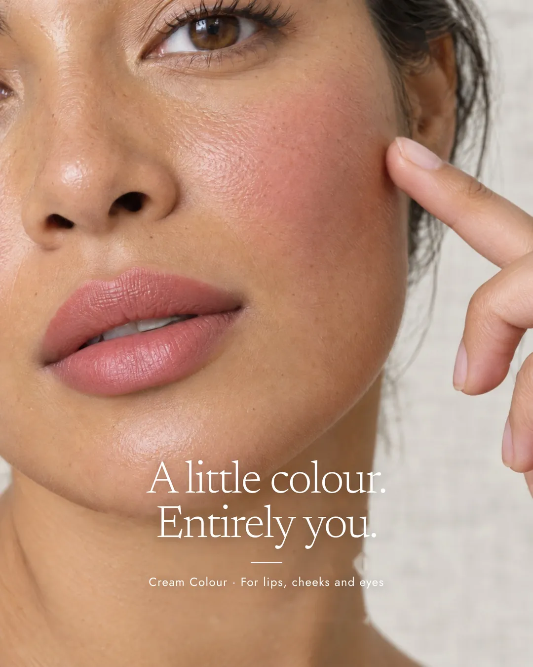
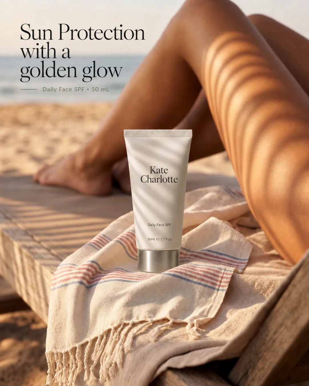
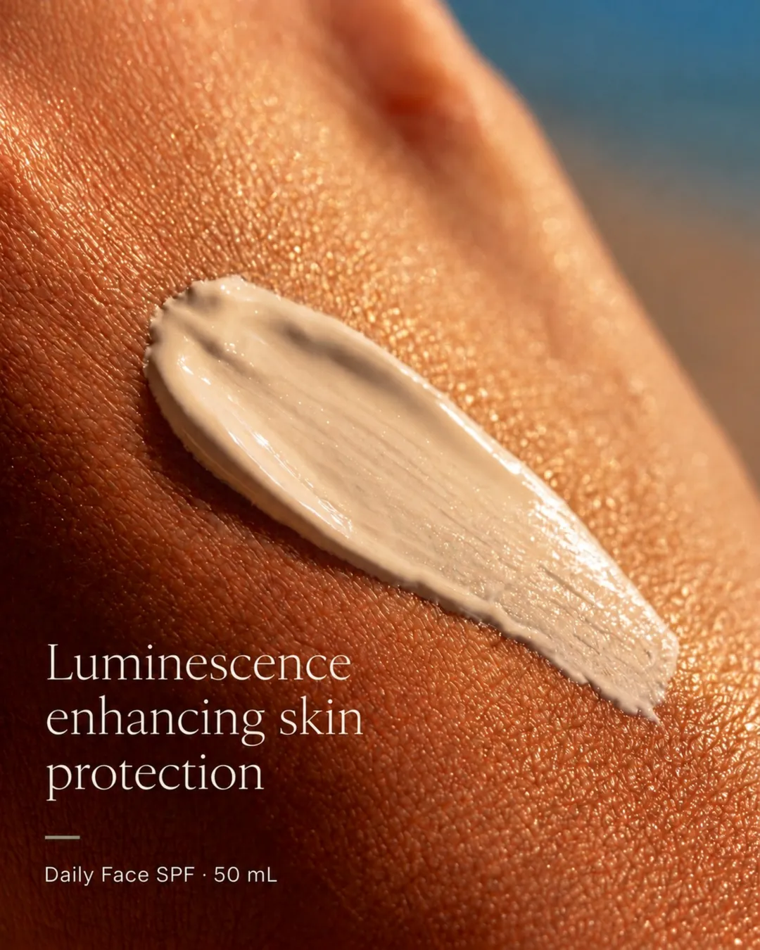
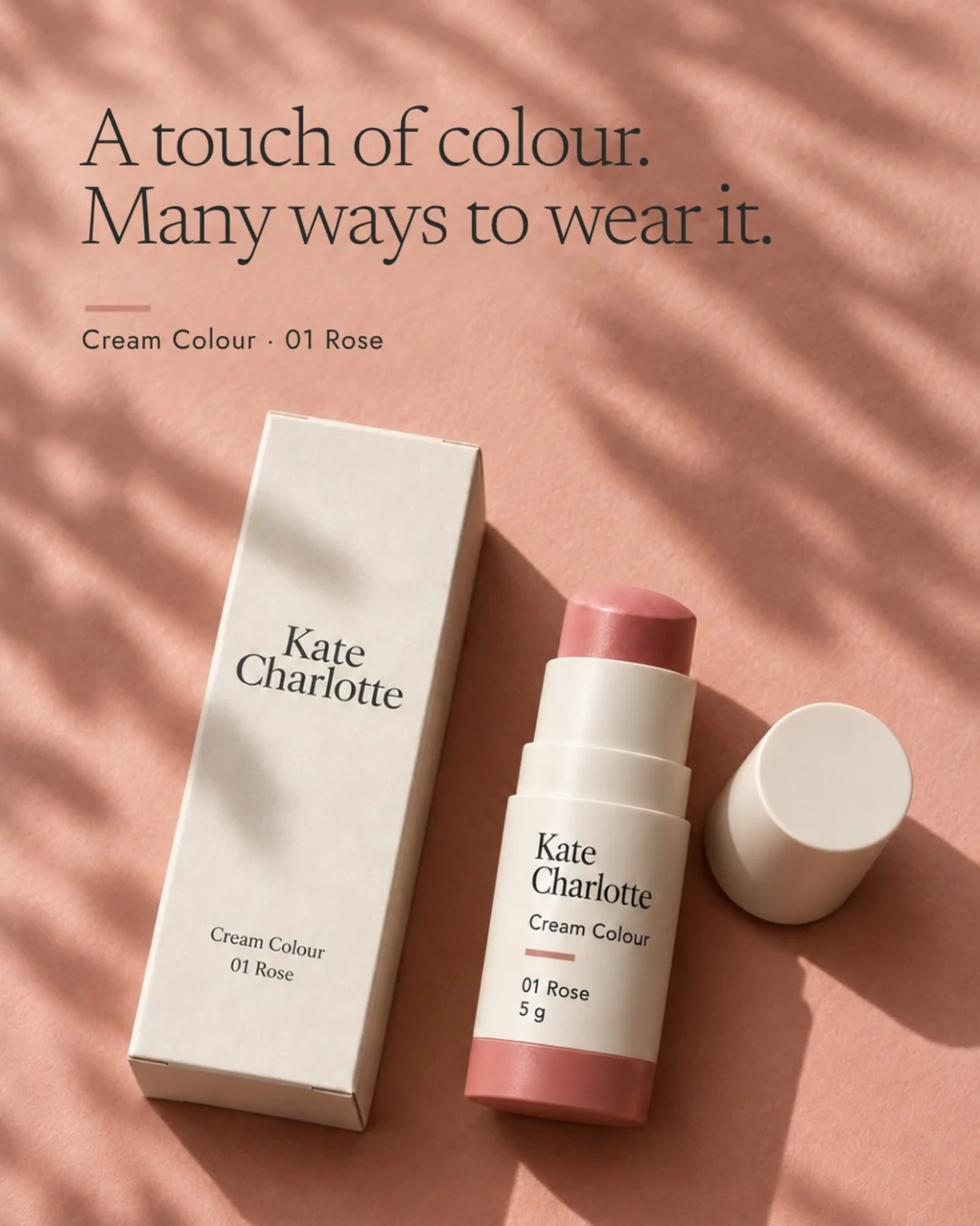
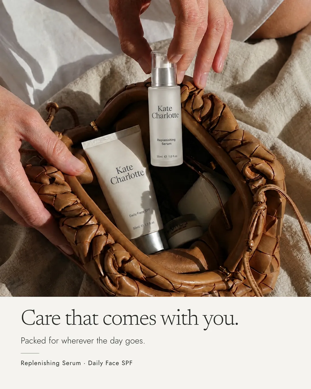
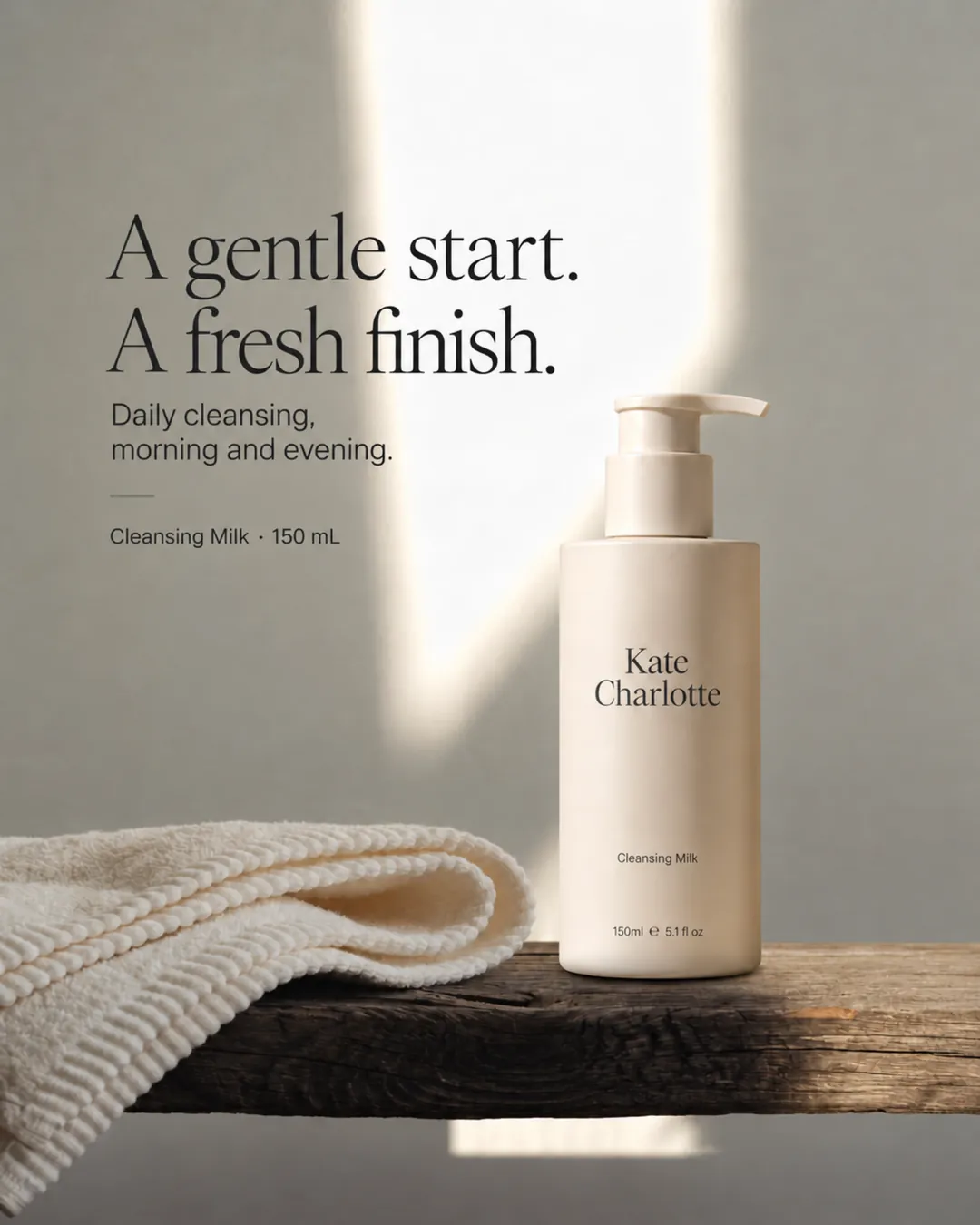

Image sources: Higgsfield (posts 01 to 03 and 09), ChatGPT (04 to 07), Adobe Firefly (08).
The decisions behind the brand.
Creative direction only matters if a business can act on it. These are the five calls that shape everything above, and how each would be tested before launch.
- 01
Who it serves
A woman who reads labels and pays for quality, but wants fewer decisions in her morning. She buys to replace a daily staple, discover a color she can wear several ways, give a considered gift, or replenish what she trusts.
- 02
Why this range
Cleansing Milk is the accessible entry point. The Replenishing Serum is the ingredient-led hero. Cream and SPF are the daily repeat purchases. Cream Colour gives the range assortment depth and a reason to return for a second shade.
- 03
Why this positioning
A US-first proposition with a South African botanical at its core. The resurrection plant gives a memorable ingredient story and a distinct visual world, rather than another clean-beauty claim, while the revival stays a story, never a skin claim.
- 04
How she discovers and buys
Campaign builds the world. Social carries one product and one idea per post. The website leads with the routine, then color, then the ingredient. CRM teaches the routine one product at a time and drives the second purchase.
- 05
How it would be validated
Customer research on labels, routines and trust; a sampling route for serum, cream and color; pricing tests against willingness to pay and margin; then the launch measures below.
What each measure would teach
- Shade selection
- Which shades lead and where customers hesitate, informing swatch design, shade naming and future shade extensions.
- Sampling conversion
- Whether trying the textures leads to purchase, informing the introductory offer and whether discovery sizes earn their cost.
- Conversion by entry product
- Which product actually opens the relationship, informing homepage order and paid media focus.
- Order value
- Whether pairings sell without a forced bundle, informing how the routine is merchandised.
- Returns
- Shade or texture mismatch, informing product page education and the routine finder.
- Repeat purchase
- Real usage windows, informing replenishment emails and when to explore subscription.
No research, sampling or sales have taken place. These are the planned tests, not results.
Eleven spreads. One reference.
The brand book turns the 34-page strategy guide into a working tool for designers, partners and agencies: what the brand believes, how it looks, and how each channel should behave.
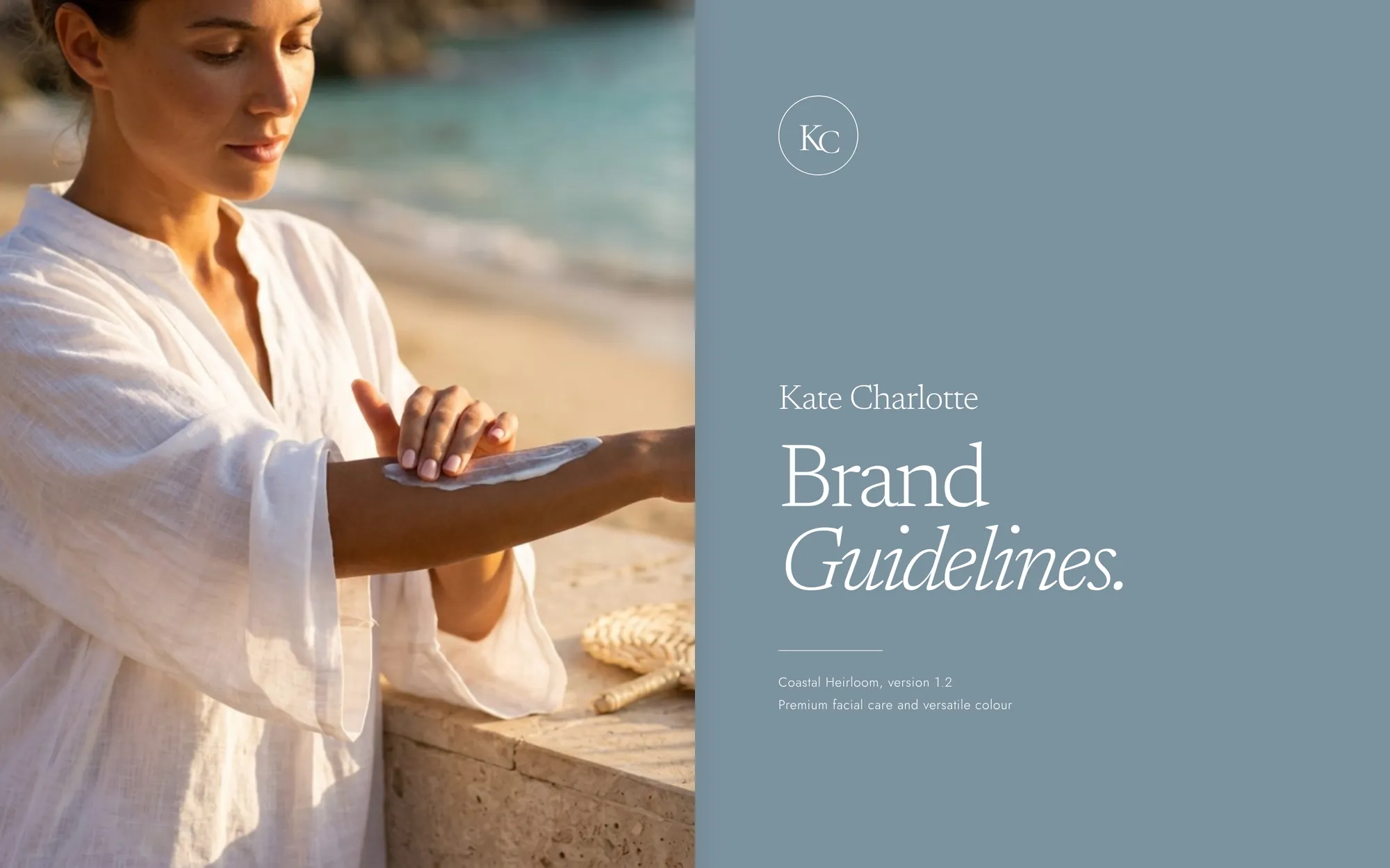
Creative direction and production.
The brief, the choices and the final edit are mine. AI tools did the production, and every asset was reviewed against the guide before it stayed.
Direction
Jade Mossop
Concept and brief, positioning, range architecture, identity and art direction, the claims rules, every selection and the final edit.
Strategy and copy
ChatGPT
Drafting support for the guide and copy library.
Imagery
Higgsfield, Adobe Firefly, ChatGPT
All imagery is AI-generated for art direction.
Design and build
Claude
Brand boards, brand book and this page.
What the work demonstrates
From insight to second purchase.
- Turning an audience insight into positioningCustomer tension, working hypothesis, positioning and four decision pillars, in a 34-page strategy and identity guide
- Building a coherent rangeFive product types and eight proposed SKUs, each with a role, a callout and a price hypothesis
- Directing a recognizable visual identityWordmark system, palette, type, packaging family, campaign photography and an 11-spread brand book
- Designing the journey from acquisition to retentionHomepage, two welcome emails, nine social posts and the opening scroll film
Care, well considered.
Kate Charlotte is a self-initiated brand concept by Jade Mossop. Product names and creative direction are concept choices; formulas, benefits, sourcing, materials and prices are development proposals. Permission to use Kate Charlotte's name remains to be obtained, and no endorsement is implied. All imagery is AI-generated for art direction with Higgsfield, Adobe Firefly and ChatGPT.