
Sienna's Beach House is 30 products across four collections. The hard part wasn't designing any one of them. It was making a cushion, a dinner plate, a beach towel and a dog bed feel like they came from the same house.
By Jade Mossop, Creative Marketing Director
Sienna's Beach House is a coastal homewares brand concept I developed in 2026: strategy, identity, product and packaging art direction, commerce and CRM, built for an online-first business. Explore the full Sienna's Beach House case study.
Start with the house, not the range
A lifestyle brand needs a world before it needs a logo. Sienna's is built around a fictional founder's home by the sea: fresh pillows for the guest room, lunch with friends, homemade lemonade with the children and Charlie, the family dog, asleep by the door. Every product had to earn a place in that house.
The customer hosts often and buys for their own home and as gifts. So the range splits the way they shop, into four collections: At Home, At the Table, By the Sea and Charlie's Corner.

Homemade lemonade with the children. The brand starts with a way of life, not a product list.
Cohesion is a system, not a style
A broad range falls apart when every category gets its own idea. Sienna's runs on three simple rules.
Blue and white lead. They read as the coast at a glance, sit with almost any interior and give every product the same base.
Accents come in small doses. Sage, coral, sun and lagoon add personality. Seasonal capsules pair two brighter colors, then step back.
One family of prints. Tide, Ikat, Fish on ticking, Seaside and Shell share one palette, and a single ticking stripe runs from the sofa to the dog bed. See the full identity.
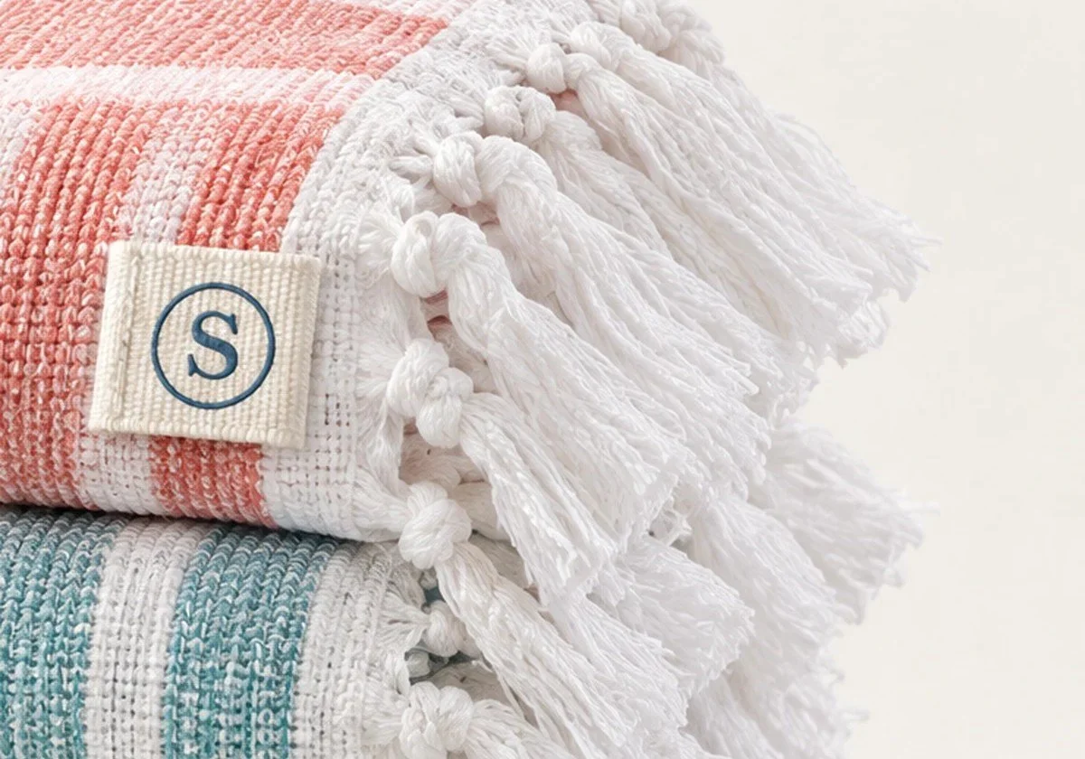
The brand lives in the seams. A small woven S on a Turkish cotton towel.
Put the brand in the seams
The logo is the quietest part of the identity. An ivory woven label carries a circled S into textile seams, a round seal sits on ceramics and glass, and a striped ribbon finishes the gifts. The mark is something you discover, not something you're sold. See the signature details.
That restraint is commercial, too. People buy homewares for the home, not the badge. A quiet mark lets one identity stretch from a cushion tab to a gift box lid without shouting.
Design for the second item in the basket
Coordination isn't only an aesthetic choice. It's the commercial test. If someone buys the cushion, does the matching throw follow? Every touchpoint was built around that question: pairing modules on product pages, a free-shipping threshold and a day-30 pairing email. Charlie's Corner has a specific job, to win orders that also include something for the home or the table. See the commerce and CRM.
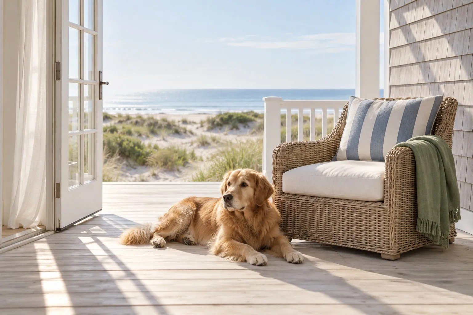
Charlie's Corner. Pieces for the dog that belong in the same house as everything else.
Thirty products in the vision, nine at launch
When I modelled the business over 18 months, the full plan didn't earn its funding. In the base case it needed about $465k and lost $8.44 on every paid first order.
So the recommendation is to launch nine products in the US, DTC first, with about $207k for a validation launch. The rest is released only on evidence: paid orders covering their own acquisition, baskets averaging 1.8 units and returns under 10%. Read the commercial case.
What I took from it
A range feels like one brand when the rules are simple enough for every category to follow. The strongest identity work on a homewares range is often the smallest: a stripe, a palette, a label.
And cohesion is only worth designing if it changes what goes in the basket. That's the first thing to measure.
See how the whole house comes together in the Sienna's Beach House case study, from the first print to the second order.
Sienna's Beach House is a self-initiated concept. Products, prices, materials and figures are proposals, and all imagery is AI-generated for art direction.
