
Email is the most valuable channel a brand owns. Getting it wrong is a design problem, not a deliverability one.
By Jade Mossop, Global Creative Marketing Director
Your mailer is not competing with other emails. It is competing with everything else on the phone: messages, feeds, notifications and whatever the reader was doing a second ago. The brands that win in the inbox are not the ones sending more. They are the ones doing fewer things properly.
These are the ecommerce email marketing best practices I come back to, in the order they matter, from running email across DTC brands including The Cat Ladies and Activ O2.
Subject line best practice: it is the whole game above the fold
On a phone, the inbox shows a sender name, a subject line and a sliver of preheader. That is your entire shop window. Keep subject lines short enough to survive being cut off on a small screen, and lead with the value rather than the brand name. The preheader is not an afterthought. It is a second subject line, and it should extend the first rather than repeat it or default to "View this email in your browser".
Test subject lines against click-through rate, not open rate. Since iOS 15, Apple Mail Privacy Protection preloads tracking pixels for mail delivered to the Apple Mail app, which inflates reported opens whatever the subject line says. If you are A/B testing on opens, you are largely measuring noise.
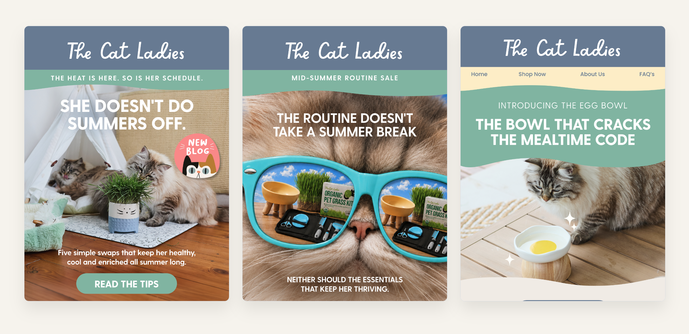
Above the fold on three mailers for The Cat Ladies: one headline, one product story, one button each. See the full case study.
One email, one job, one call to action
The most common reason an email underperforms is that it asks the reader to do too many things at once. Choose the single job the email has to do, and give it one button. Put it near the top for the reader who already knows what they want, and repeat it at the end for the one who needed convincing.
The button should look like a button, use benefit-led language rather than "click here", and have room to breathe. On a phone it needs to be comfortably thumb-sized: Apple's own design guidance sets the minimum tap target at 44 by 44 points.
It is the same discipline that makes automated email flows pay you while you sleep. Every message earns its place by moving the reader one step, not five.
Email design: images versus live text
For visual brands, this is the hardest habit to break. A mailer built as one large image is a deliverability risk before it is a design choice. It loads slowly, it can look suspicious to spam filters, and it disappears entirely when images are blocked.
The image can lead. The headline, the offer and the call to action belong in live text. Add alt text to every image. A subscriber reading with images switched off should still know what you are offering and how to act on it.
Mobile email design is the default, not a variant
Design and proof on a phone first. A single column, body copy large enough to read without zooming, and buttons sized for a thumb. Then send yourself a test and read it on the device your customers actually use. Every time.
How long should a marketing email be?
There is no universally right length. There is a right length for each job. Promotional sends should be short and direct. Welcome and onboarding emails can run longer, because the reader has just opted in and is genuinely curious. Newsletters earn their length through value, not obligation.
The test is not "how long is this?" It is "does every paragraph earn its place?"
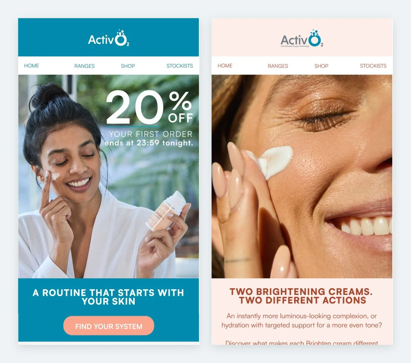
Two October sends for Activ O2: a 20% first-order offer that ends tonight, and a comparison of two brightening creams. Each send has a single job.
Measure clicks and revenue, not opens
Open rate is flattering and unreliable. I have seen a brand's single best-performing email by open rate, an editorial piece subscribers genuinely wanted, sit near the bottom for clicks, because a great open with a buried call to action converts almost nobody. Click-through rate tells you whether the email was compelling enough to act on. Revenue per send is the number that matters commercially.
Where those clicks land matters too. In peak season, email traffic deserves the same landing-page thinking as paid traffic, which is why I wrote about where to send your peak event traffic. And your list is the audience you already paid for. Every careless send spends some of that investment.
The move for you
Before your next send, especially in peak season, answer three questions. What is the single job this email has to do? Is there one clear call to action that performs that job? Does the subject line tell the reader why to open it before a phone cuts it off? If all three are yes, send it. If any are no, keep working.
